View Prototype
The JPMorganChase Employee Intranet is a conceptual employee intranet experience that focuses on being more proactive for the user, more personalized, and more intuitive.

Project Type
Intranet - Conceptual
Team
UX Designer - Me + 3
Visual Designer - 2
Producer - 2
Company
JPMorgan Chase
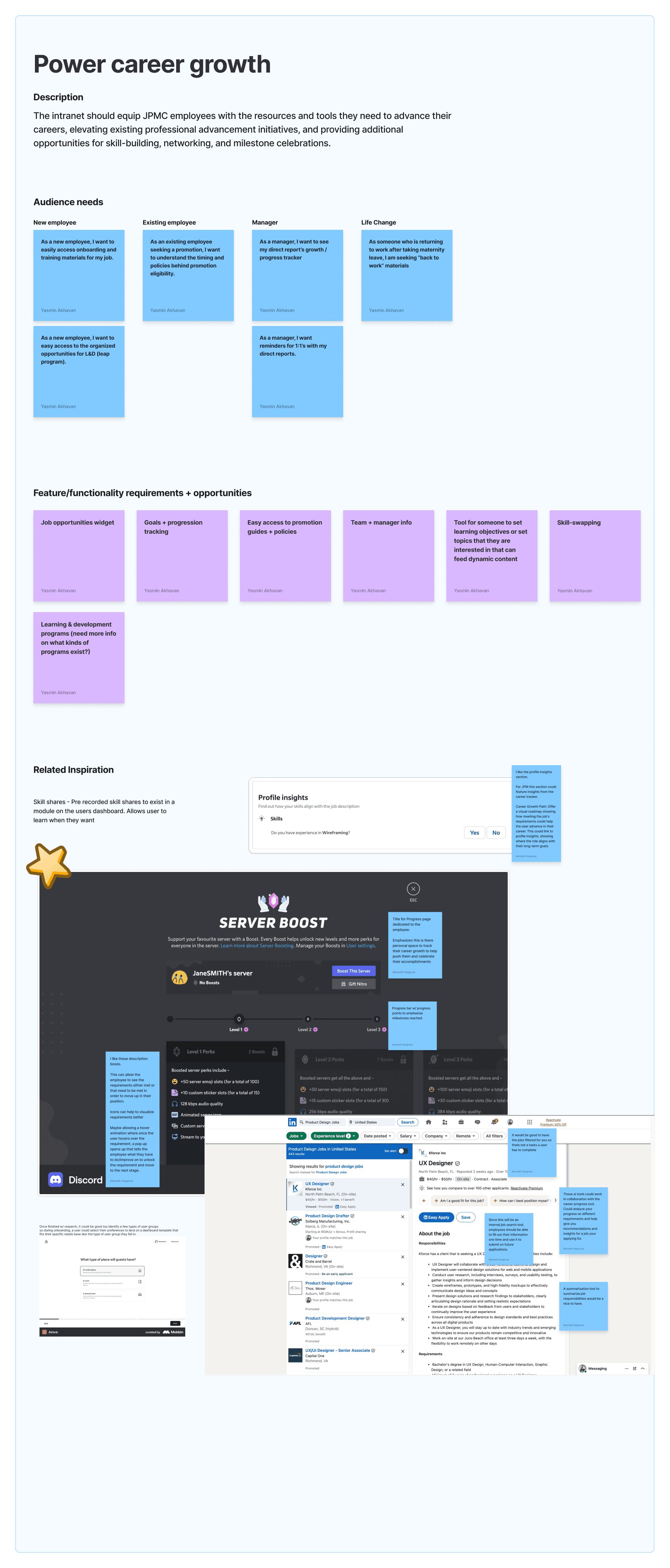
I started the project by inspiration gathering. Doing this allowed me to uncover areas of oppurtunity.
Research and Inspiration
I began analyzing consumer grade products—focusing on proactive" experiences in navigation, quick links, and notifications. I used Figjam to organize my findings. I added screenshots and notes to inspiration examples to later share with the team.
Pulled insights from JPM Personas. I brought these insights into Figma so the wireframes would reflect real user needs. The three key experience scenarios we focused on were new hires, managers, and existing employees.


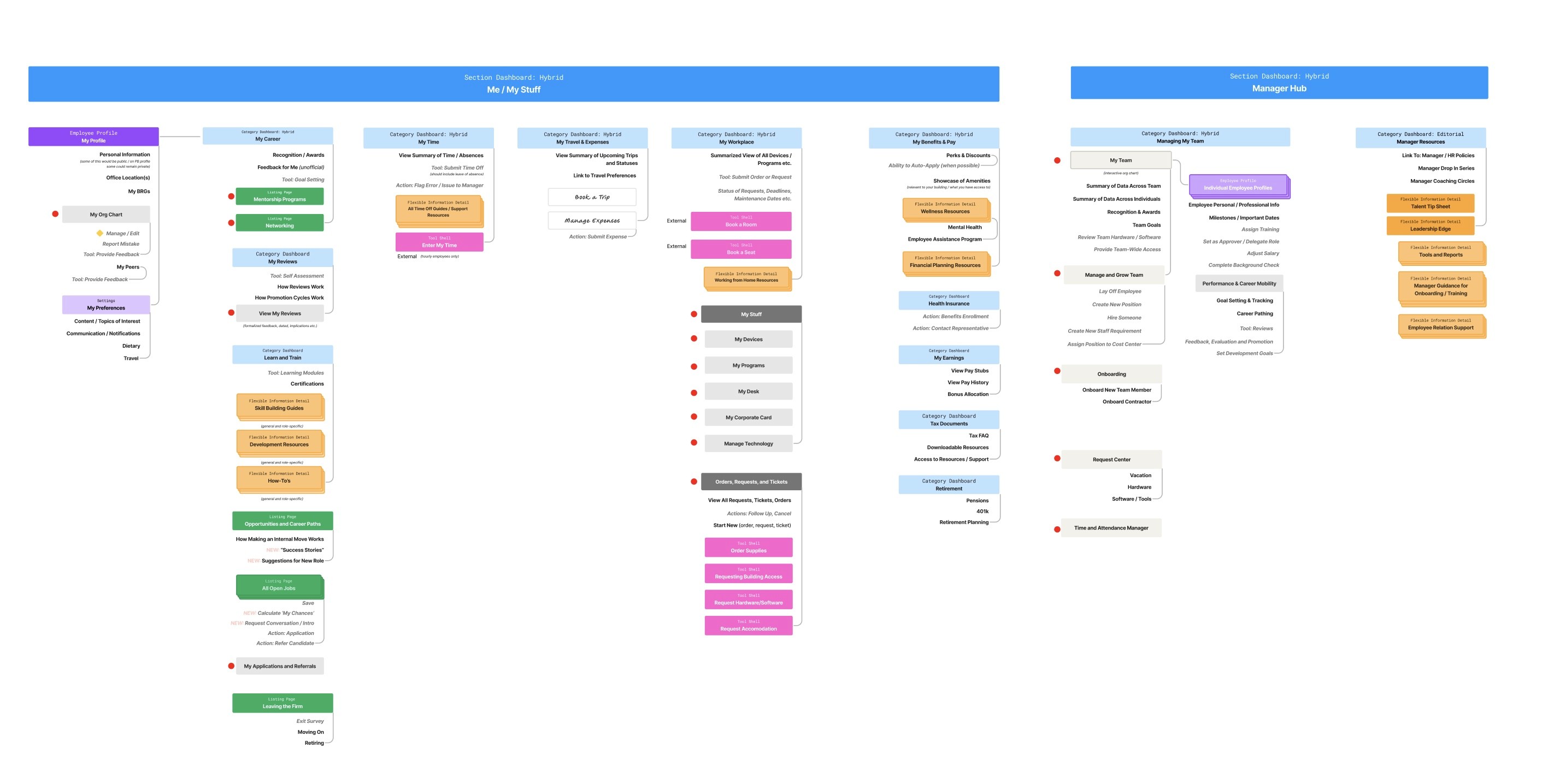
In parallel we worked on Site Architecture. We had to figure out how to templatize a dashboard experience that would be dynamic.
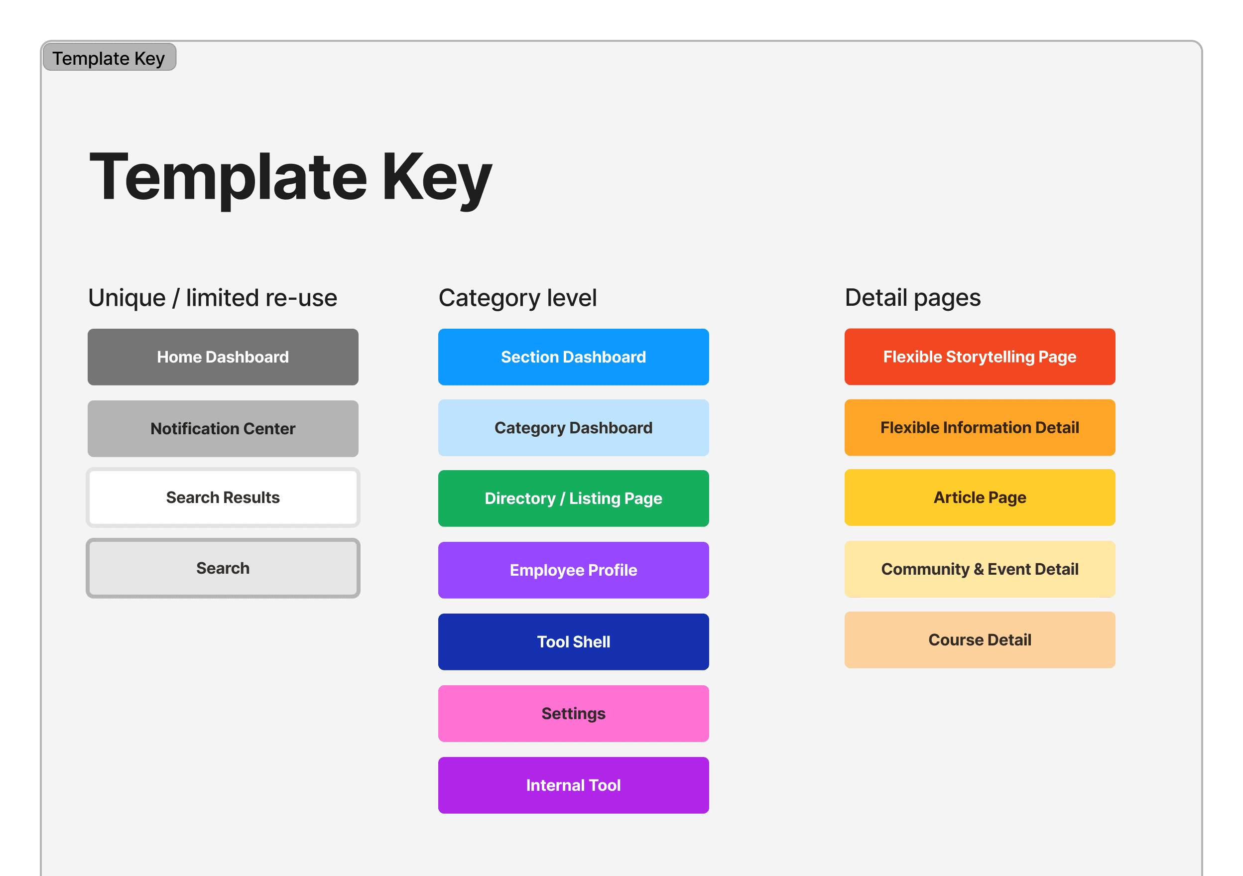
Defining Template System
Match page templates to the site maps - Unlike most websites, where a single template is used for multiple pages, the new JPM dashboard experience changes its layout depending on the end user. To illustrate this concept, I was given a template key developed by the project lead and our senior designer. Together, the senior designer and I matched these page template types to the existing site map (the exercise is pictured below).
Template types were broken up as follows:
Unique/limited reuse: Essentially navigation tabs, search, and notifications
Category Level: Settings, tools, employee, profile, listing pages, and section/category (content module) dashboard
Detail Pages: Article page, community page, course page, information detail page, etc.
Navigation
Additionally, I explored two mega-menu strategies—progressive versus fully exposed. I compiled examples from reputable websites and annotated them in Figma, focusing on which approach would best serve JPMC’s employees. In the end, the team chose the progressive exposure navigation.
Ultimately, this interaction pattern allows users to easily digest information preventing fatigue. This pattern helps users digest information easily, reducing fatigue. JPM's research enables them to implement the most popular navigation paths logically.
Default

Active

As the team begun designing, I was able to contribute to specific features. Feature #1 - JPMC Calendar.
Homepage and Dashboard
I Researched how “consumer-grade” experiences handle personalization, which informed the intranet’s quick links, task cards, and recommended content
Additionally, I assisted with designing modules in sections such as People & Community, Newsfeed, plan-ahead, and “PTO/holiday” calendar module of the new joiner dashboard experience
(Module Featured Below)


Feature #2 - Career Learning and Development Module.
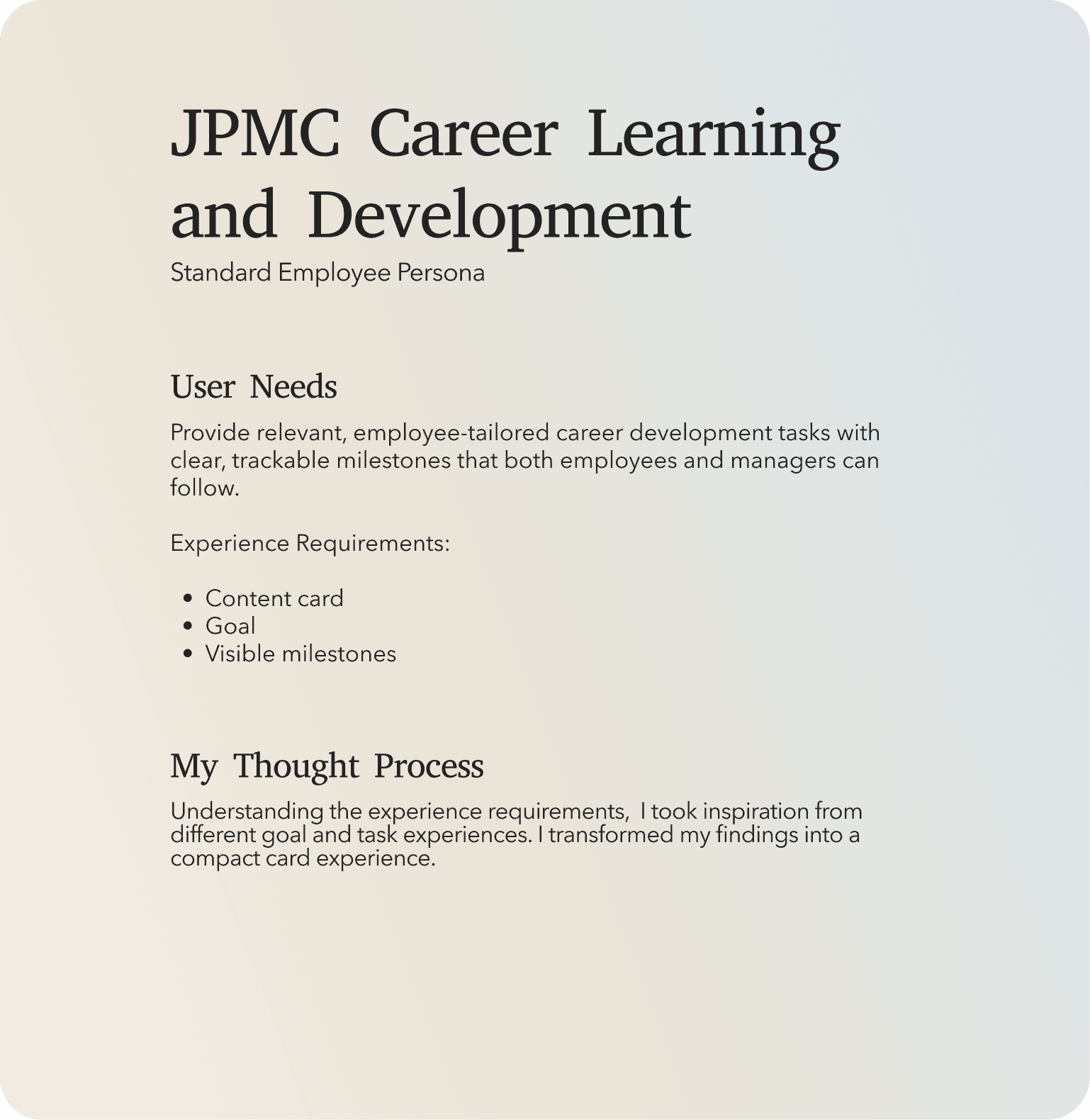

Career learning and development content card
Reflections + Takeaways
This project was one of the most exciting and dynamic endeavors I’ve tackled at Code & Theory. I explored everything from initial inspiration and information architecture to wireframing and high-fidelity design. Our team pushed for innovative interaction patterns and developed a new intelligent search feature for JPM employees. While the work was conceptual, I’m eager to see how JPM implements and refines it. This intranet experience is far more personalized, intelligent, and intuitive than typical solutions, and I’m proud that our groundwork will guide similar projects in the future.
I’m most proud of…
I contributed specifically to the employee calendar feature and the “manage your week” module. Because we were building out a dashboard, it included various modules in a confined space, so I had to consider both interaction challenges and sizing constraints. This meant not only solving for functional design issues, but also ensuring the layout remained compact while clearly conveying key information.
I Added Value…
The team was comprised of visual designers and UX Designers who were Senior level and higher. Being the least experienced designer on the team, I still found ways to add value:
Client Meetings: I was attentive, took notes, and messaged team members privately with ideas as soon as topics arose—letting them know I was actively thinking through points from both our team and the JPM clients.
Collaboration: I was paired with a senior designer. Whenever I was online, I consistently asked if she needed help and made it known to the rest of the team that I was available for assistance.
Ideation: I’ve been told I excel at coming up with ideas and seeing problems from fresh perspectives. Throughout the project, if an idea came to mind, I sketched it on my iPad and shared it with the relevant team member. The team was incredibly supportive, encouraged me to keep sending inspiration, and often referenced my sketches for wireframes and final designs.
What the work did for me?
This project helped me grow in multiple ways as a UX designer:
Balancing Stakeholder Needs: I learned how to accommodate diverse users—from new hires to managers—within a large-scale corporate environment.
Rapid Iteration: Due to tight deadlines, we had to iterate quickly, which taught me how to synthesize feedback in real time and refine designs under pressure.
Personalized Dashboard: Because this experience was meant to be personalized, scalable, and adaptable based on user needs, it was fascinating to see how my teams process for templatizing a distinctive dashboard experience.