Soundcheck "Partners Page" Redesign
Soundcheck Prevention Network is a non-profit, substance misuse prevention organization. They help schools develop student-centered, customized programming to increase student wellbeing and prevent misuse of alcohol, nicotine and other drugs.
Project Type
Live Client
Location
Remote
Role
Product Designer/Researcher
Company
Soundcheck
Industry
Non Profit
Timeline
4 weeks
Brief
My role on this project was to improve the user experience of the partner page so Soundcheck can implement improvements in the future. We focused specifically on desktop view because 90% of potential clients reach out on desktop.
Problem
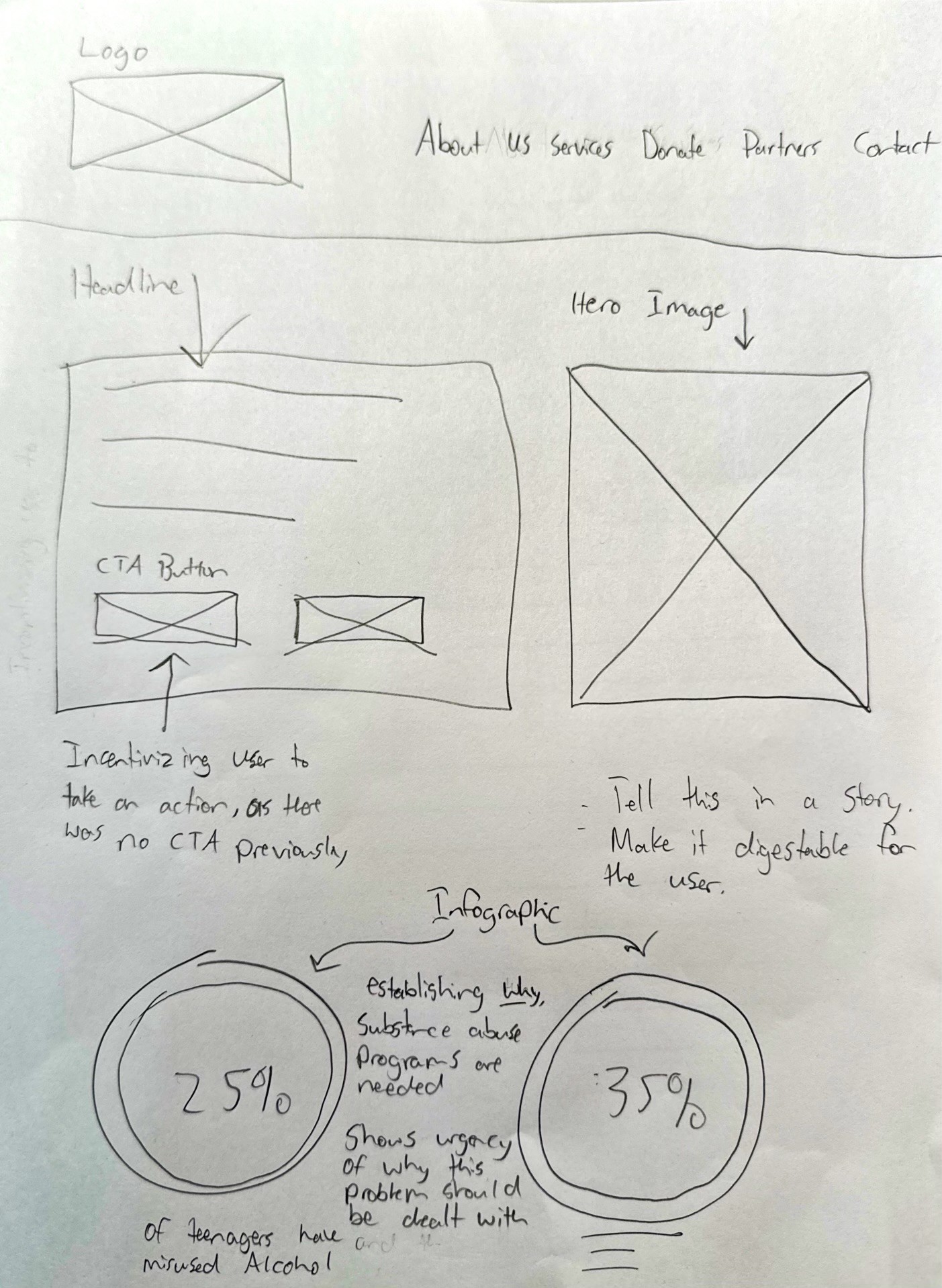
Soundcheck needed our help fixing issues surrounding their partnership initiation and information architecture of the Soundcheck partner page. We then designed a solution with clear steps to initiate partnership through clear call to action buttons.
Now that you’re familiar...
Lets Take a few steps back
Discovery Research
User Persona
Based on conversations with a current teacher in the school system, I gained 6 important insights to help me understand the target user.

Interests
Healthy and positive habits
Influences
Past Curriculums (Dare, Truth.com)
Goals
Students having a clear understanding on why abusing drugs is harmful physically and mentally
Needs and Expectations
Long term supportive care within the school
Motivations
Underage drug use
Pain Points
and
Frustrations
Decision tree complications and nuances
Key Takeaway:
Validates need for redesign
Potential partners need detailed information to make an informed decison
Information must be easy to navigate and understand
User Journey
To identify opportunity areas, I created a user journey flow to visualize the target user journey in the process.
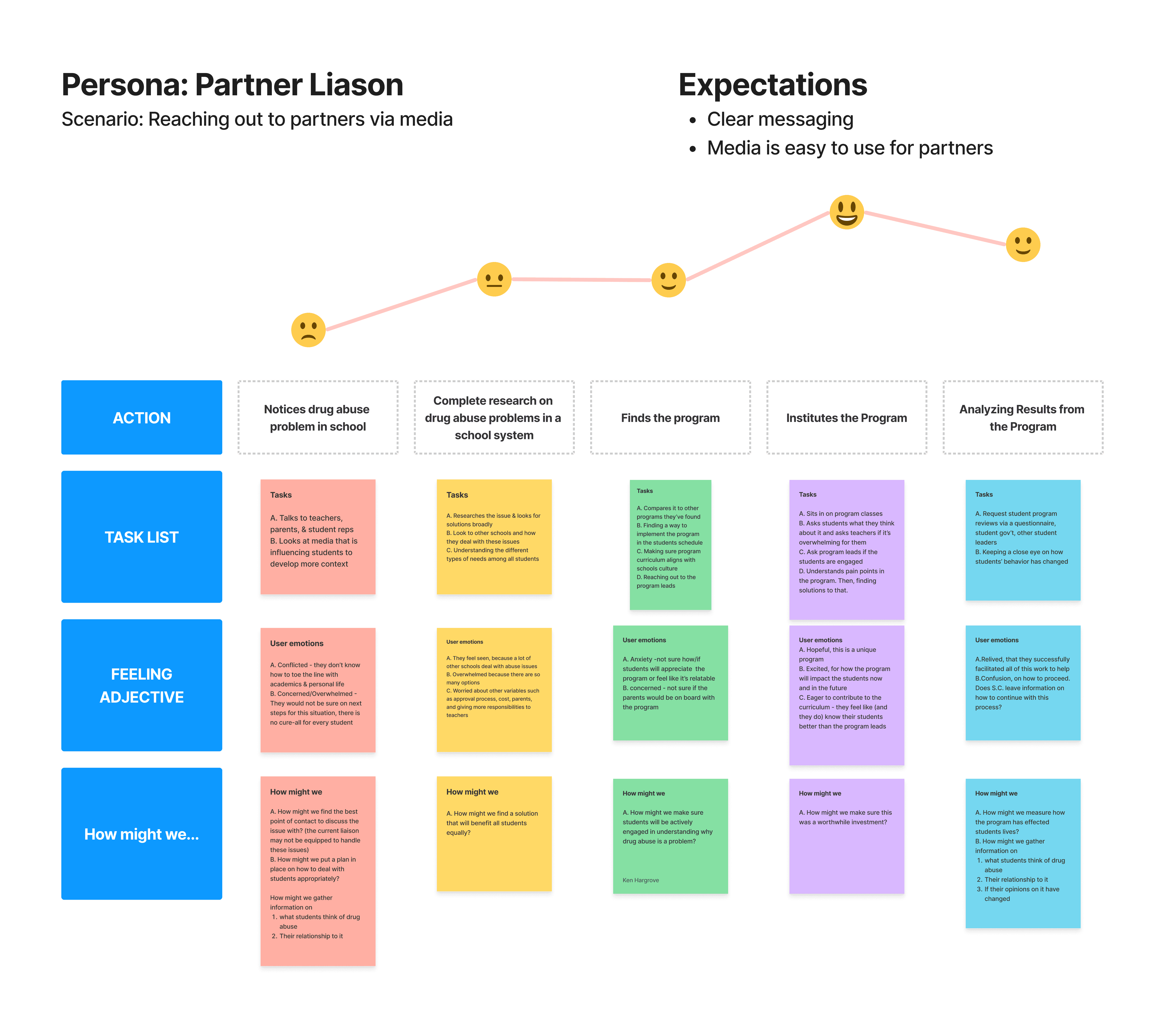
Key Takeaway:
Most important area of opportunity is showing the potential partners that making the investment in Soundcheck is important for students mentally and physically
Assists with complex decision making from an organizational perspective
Problem Scope Validation
Research Insight
From understanding the user persona and journey I gained the following insight:
Problems with clear messaging and frustration with complex decision-making highlight the need for easy navigation and clarity
*This insight influences the "Finds the program", and "Institutes the program" actions in the user journey *
Business Case
As a result of my research, the redesign will ultimately benefit Soundcheck by:
Keeping potential clients on the site longer
Incentivizing potential clients to take an action that leads to partnership initiation
Give potential clients more clarity to make an informed decision in order to partner with Soundcheck
Solution Discovery
Discovery
I focused on these three discovery points to help guide myself during the process of research and design.
Key Insight
Potential clients struggle with the way information is presented on the website
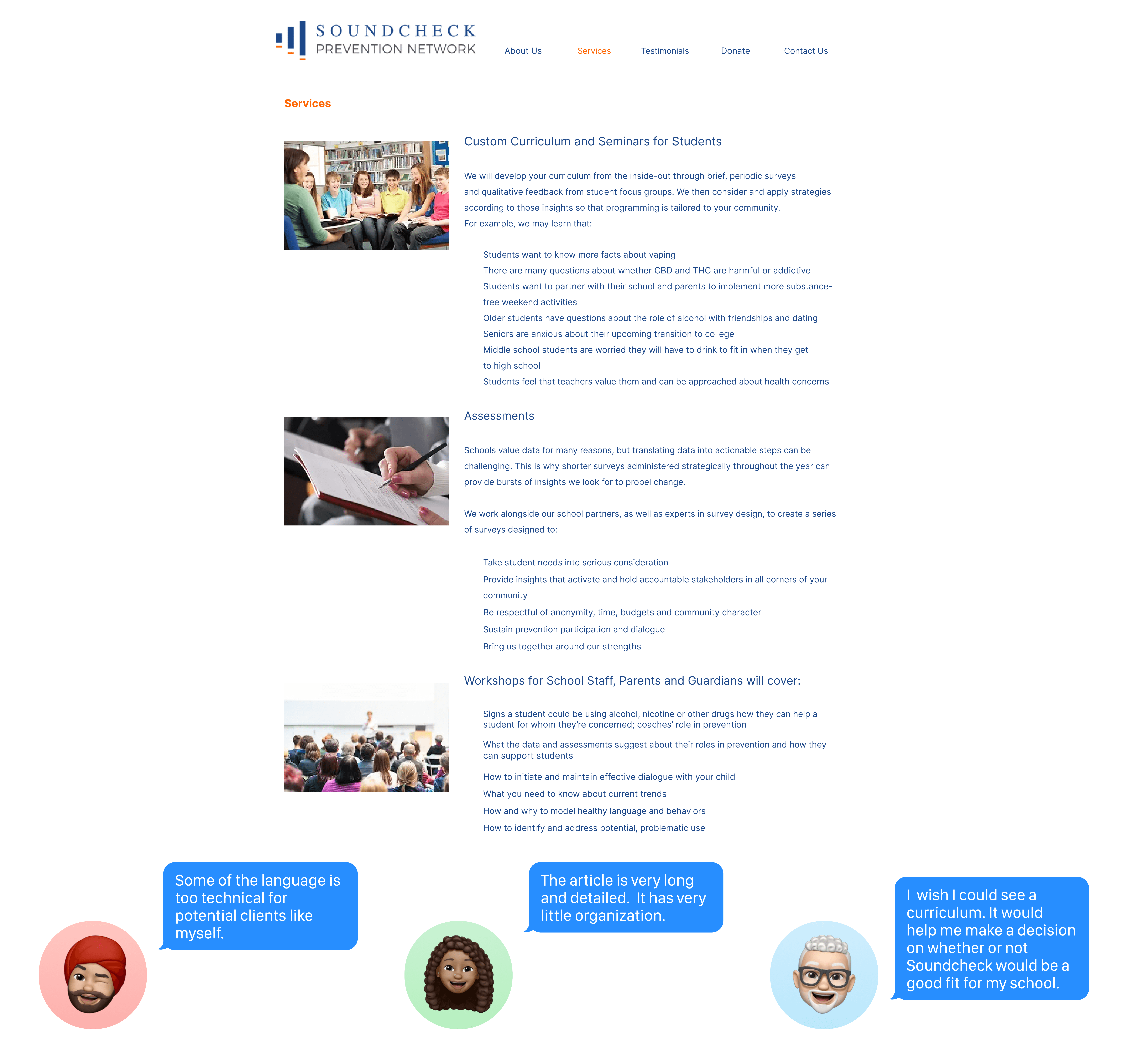
Why did users struggle?
The page presents a lot of information without clear headings,subheadings, or visual cues to guide the potential client through the content.
Curriculum
Blindness
Potential Soundcheck partners are not given the ability to see how a curriculum would look like at their particular school.
Users struggled to find a clear and prominent call-to-action, like a button or link, that encourages the user to take the next steps to connect with Soundcheck.
Key Takeaway:
Users struggled to navigate the Partner Page
Synthesized learnings into the three categories listed above
All This boils down to…
Potential Clients lack the necessary information to make an informed decision about partnering with Soundcheck
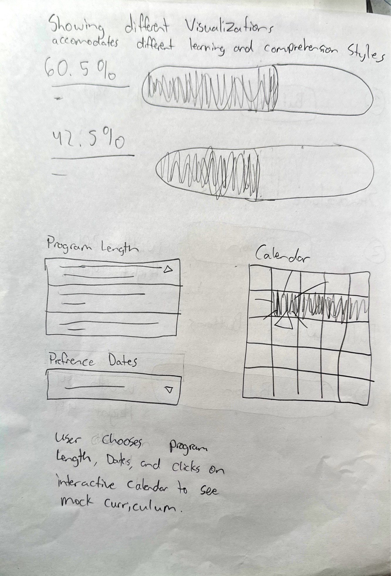
Low-Fidelity Wireframe
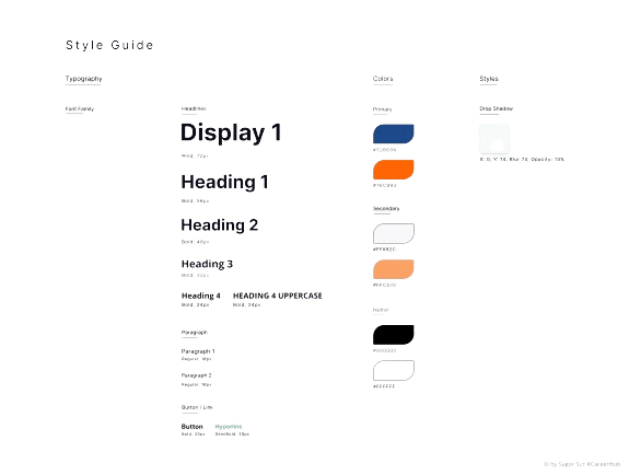
Visual Style Guide

Solution
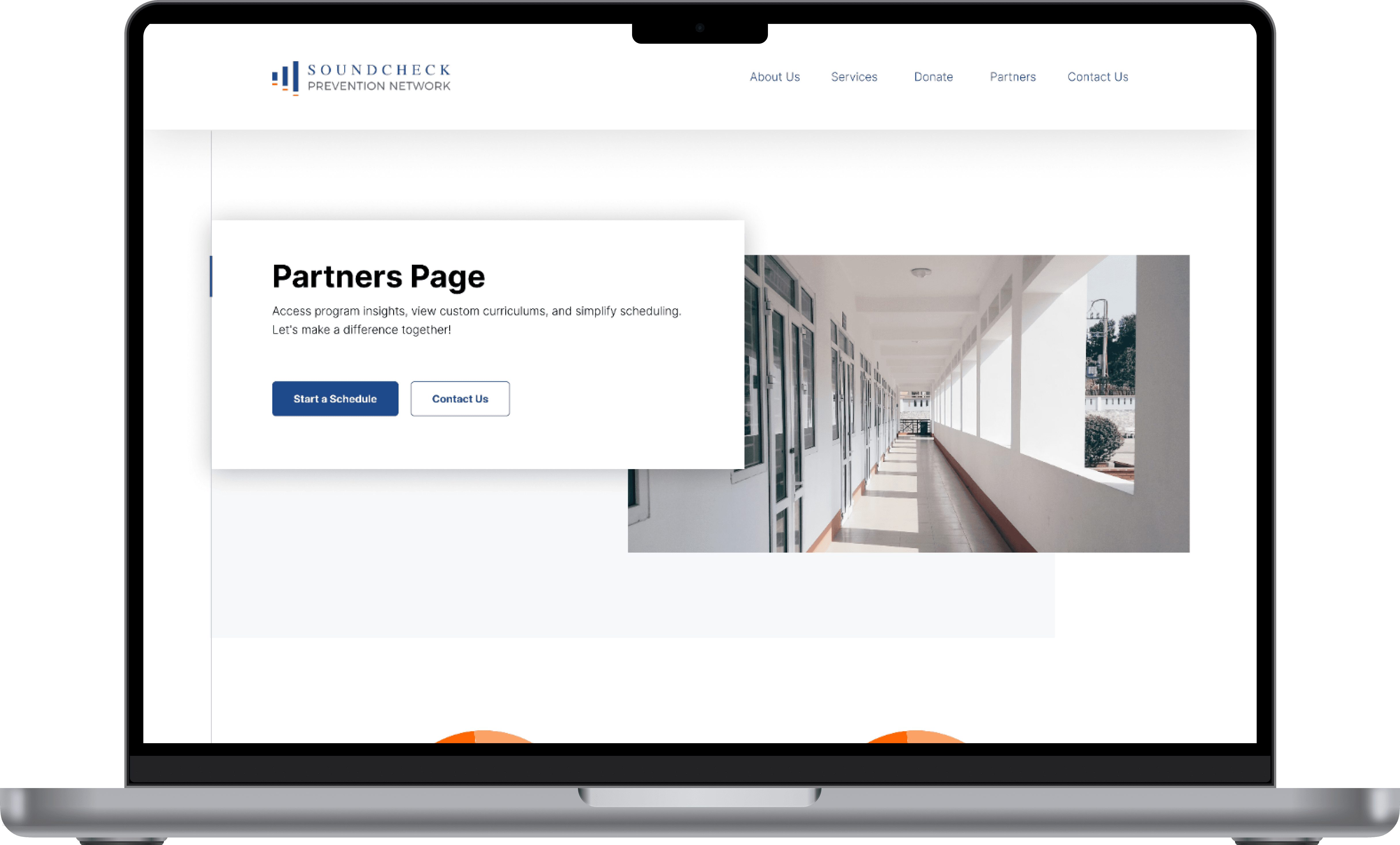
Partner Page Refined
Hero Section:
The webpage uses engaging visuals to clearly outline its purpose. It features two call-to-action buttons, "Start a Schedule" and "Contact Us," positioned in the Partners Page section to facilitate client engagement with the Soundcheck team.
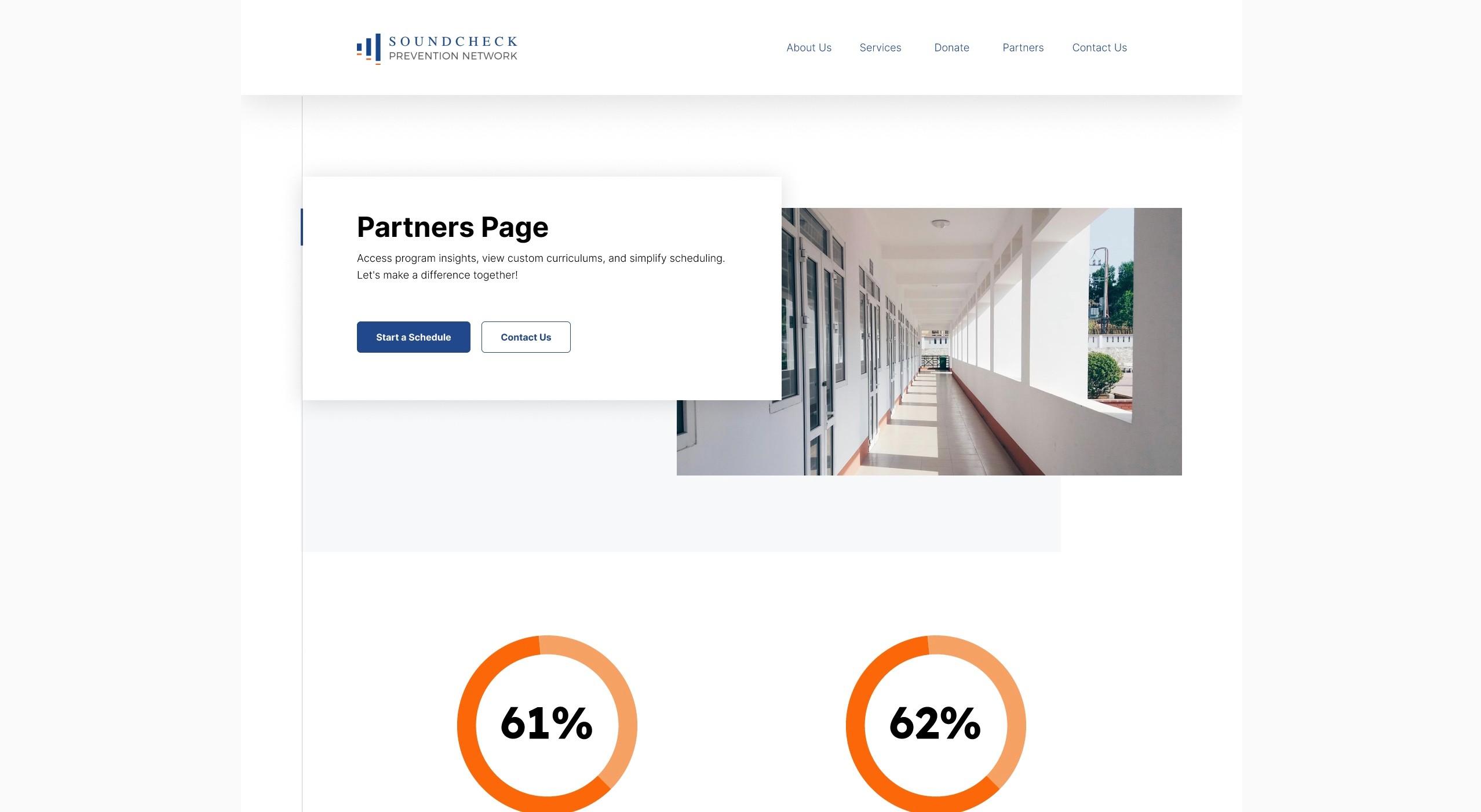
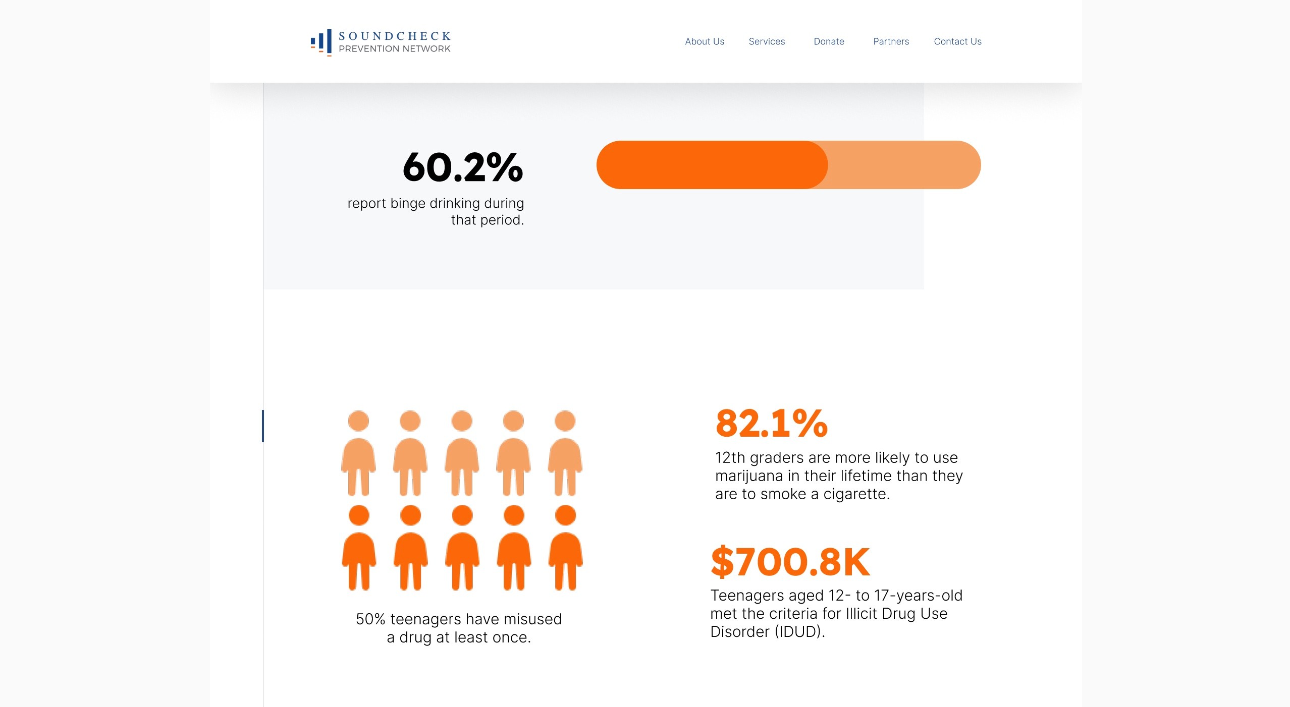
Data Visualization Section:
Emphasizes the seriousness of underage substance abuse and the risks of not addressing it.
Different data visualizations on the website cater to various learning styles,
improving comprehension.
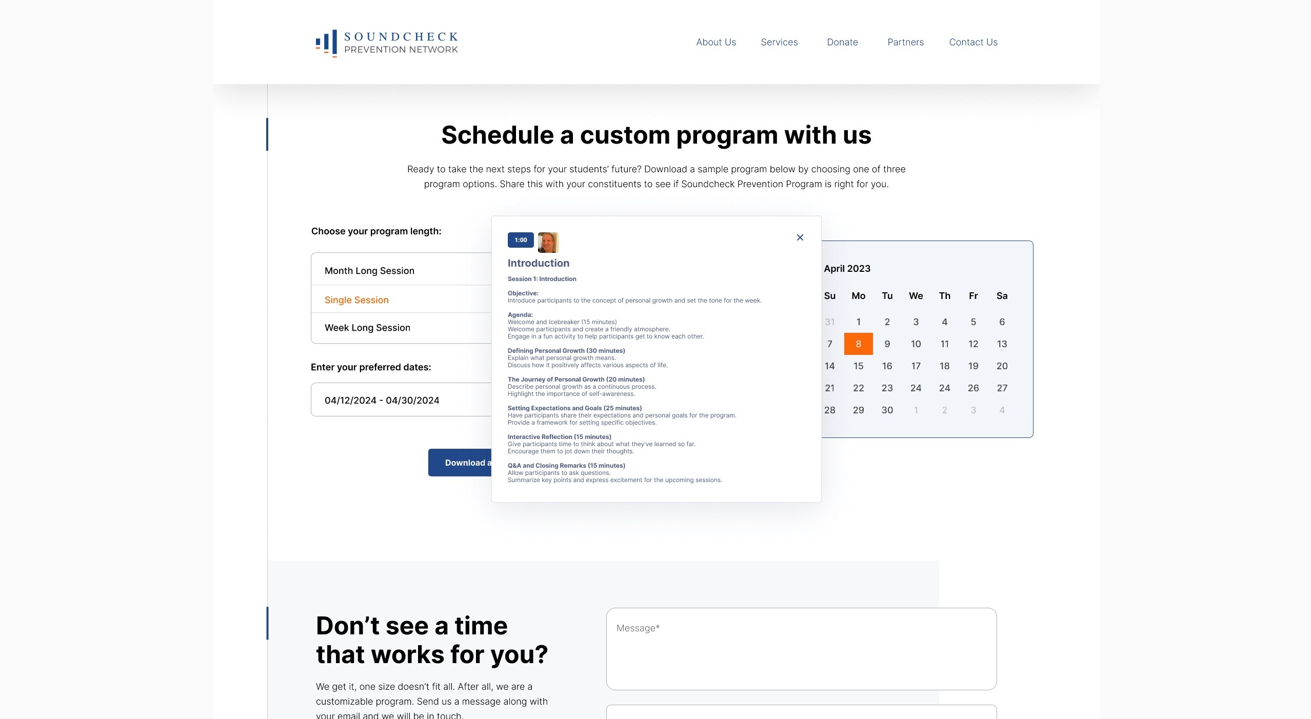
Interactive Calendar Component 1:
On the left side of the screen, users select the duration of their program at a school
—ranging from a single day to a month. This feature shows potential partners a sample
curriculum for the chosen timeframe
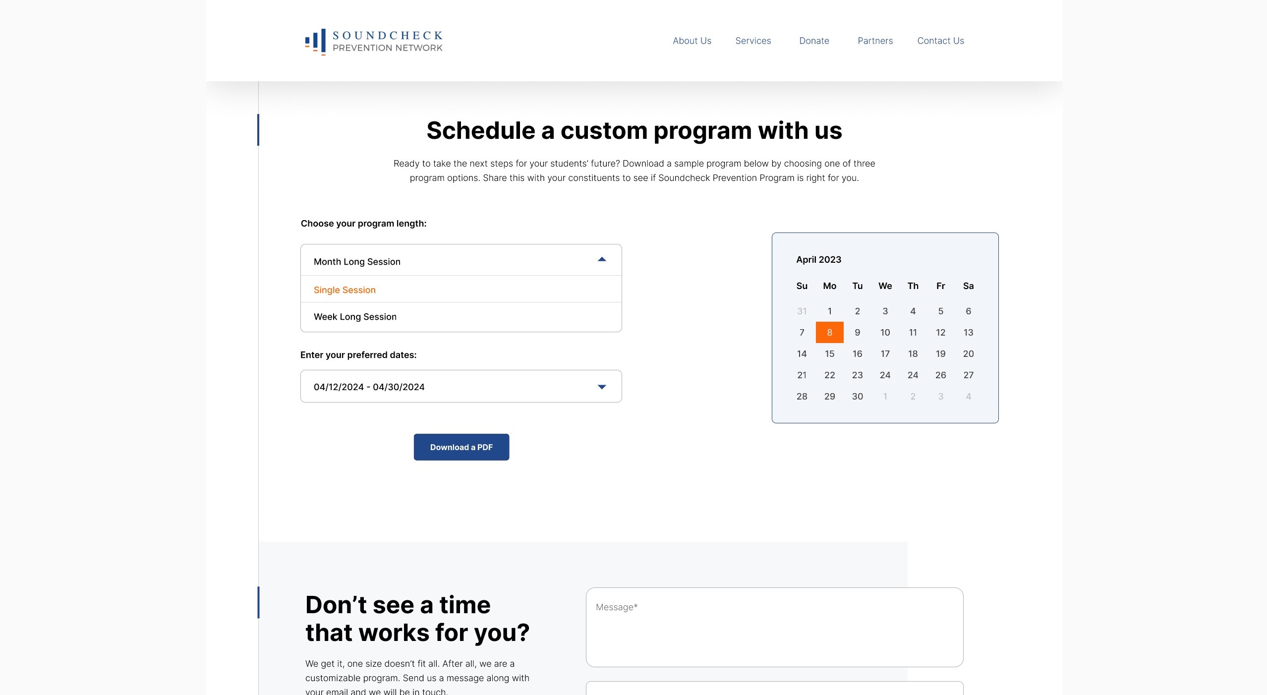
Interactive Calendar Component 2:
On the right side of the screen, the calendar highlights the user's selected timeframe (single day, one week, or month).Clicking on different dates allows users to view an overview of the program for those dates
PDF Download:
Helps create Content transparency for prospective and onboarded partners,
and Prevents constant back and forth.

Reflection
Looking Back, Moving Forward
Final Results:
As a result of all this work, the site now has an emphasis on the path to engage in clear onboarding, consideration purchase, and more defined steps to take as partners. I enjoyed the challenge this project presented me! I had the unique opportunity to work with a live client and engage with them from start to finish in order to execute a useful solution.